International Airports
The other day while riding the rental car shuttle to the Albuquerque International Sunport (ie, the ABQ airport), I started thinking about how some airports are labeled as being international while others are not. My first thought was that it didn't take much for an airport to become international- all you'd need is a few flights to Mexico. However, Wikipedia points out that international airports have to have customs and immigration, and generally have longer runways to support larger planes. In any case, it still seems like the international label is on a lot more airports than usual. This got me wondering, how different are the workloads of different airports anyways?
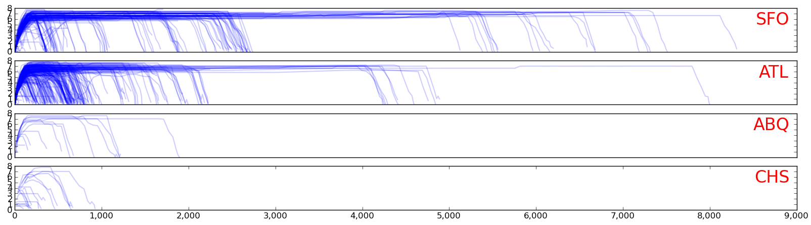
Since I have a big pile of airline data, I decided to see if I could better characterize airports by analyzing where the outgoing flights were heading. I wrote a Python script that takes a day's worth of flight data, extracts all direct flights that left a particular airport, and plots their altitude/distance traveled on the same graph. The X axis here is the cumulative distance the plane flew, calculated by summing up the distance between the coordinates in its track. The Y axis is altitude in miles. I picked several flights and verified that my distances roughly match the expected optimal path between cities (see AirMilesCalculator.com).
Below are some plots for SFO, ATL, ABQ, and CHS, all of which are international airports. A few interesting things pop out looking at the charts. First, SFO has a broad mix of travel, including local (LAX is about 340 miles), domestic (many stops between here an the east coast), and international (the large gaps in distances are for oceans). ATL is similar, but they have a lot more variety in the under 1,000 miles range (due to the number of airports on the east coast). ATL also has plenty of international flights, but they're shorter since Atlanta is closer to Europe. Interestingly, the longest flights for both SFO and ATL in this sample were both to Dubai. In contrast, the international Sunport (ABQ) and Charleston (CHS) didn't seem to have much range. In ABQ's case, this can be partially be attributed to the fact that it's towards the middle of the country (and close to Mexico).
This started out as a fun project that I quickly hacked together to get a first order result. I had the data, so all it took was building something to calculate the distances and plot them. The first plots I did showed a lot of promise, but I also noticed a lot of problems that need fixing. These fixes ate up a good bit of my time.
Distance Problems
The first problem I had was that my distances were completely wrong. I had several instances of flights that were going 30,000 miles, which is bigger than the circumference of the planet. My initial thought was that I wasn't properly handling flights that crossed the international dateline. I went through several variations of the code that looked for dateline crossings (ie, lon goes from near +/-180 to near -/+180) and fixed their distances. This helped but the long flights were still 2x longer than they should have been.
I realized later the problem was my distance calculator. I'd hacked something together that just found the Euclidean distance in degrees and then converted degrees to miles. That would be ok if the world was flat and lon/lat were for a rectilinear grid, but the world is round and lon/lat grid cells become smaller as you near the poles. I felt pretty stupid when I realized my mistake. A quick look on stack/overflow pointed me to the Haversine formula and gave me code I could plug in. The numbers started working out after that.
Multihop Problems
Another problem I hit was that my original data was for what a plane did during the day as opposed to the actual flights it took. At first, I tried to just compensate in my plotter by making an inline splicer that used altitudes to chop the plane's data into multiple hops. This partially worked, but unfortunately the data wasn't always sampled at the right time, so some flights don't always go to zero. I raised the cutoffs, but then had to add some logic that figured out whether a plane was landing or taking off. A lot of the times this worked, but there were still a bunch of individual cases that slipped by and made the plots noisy.
The solution was to go back to the original data and just use the source field that sits in the data. I reworked the data and generated all single hops based on the field. A nice benefit of this approach was that it made it easier to search for the airport of origin. Previously I'd been using the lon/lat boundaries for different airports to detect when a plane was leaving a certain airport. Now I can just look for the tag. This solution does have some problems, as there are many flights that don't label their src/dst. I've also found a few where the pilot must have forgotten to change the src/dst for the flight (ie, one sfo flight to chicago went on to Europe).
Velocity Problems
The last problem (and one I don't have a good fix for) is velocity. Looking at the individual distances and times for track segments, I sometimes see situations where the calculated velocity is faster than the speed of sound (I'm assuming Concordes aren't flying). Often this seems to happen out in the middle of the ocean, when the data becomes more sparse. It could be bad values in the data, or maybe two observers reporting the same thing differently. I'll need to take a closer look at it later. For now I just put in some kludge filters that throw out flights that are out of range.
Code
I decided to go ahead and make some of the scripts I've been writing available on github. This one is called Canonball Plotter, which can be found in: github:airline-plotters